
- Project Type: Public Showcase
- Category: Concept Project. This is a fictional concept project and is not associated with any real brand, company, or third party.
- Usage: Portfolio / Non-commercial
- Applications: Guides to using the new feature on the app. These videos will be used for ads on Facebook, Instagram, YouTube, and the website.
- My Role: Motion Designer
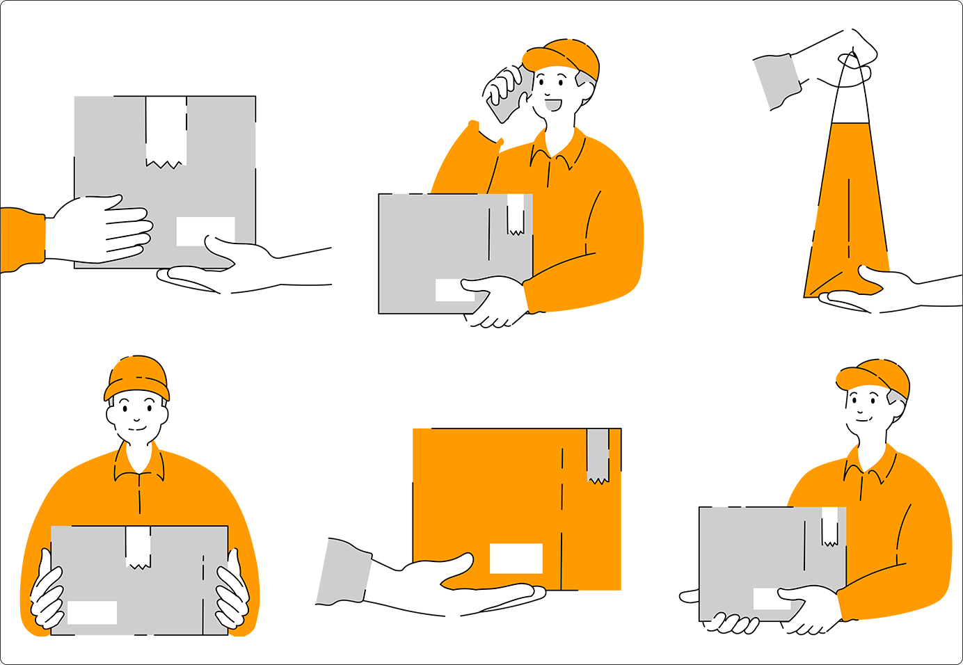
- My Contributions: Create explainer videos, intro, infographics for Fastship.
CONTECT
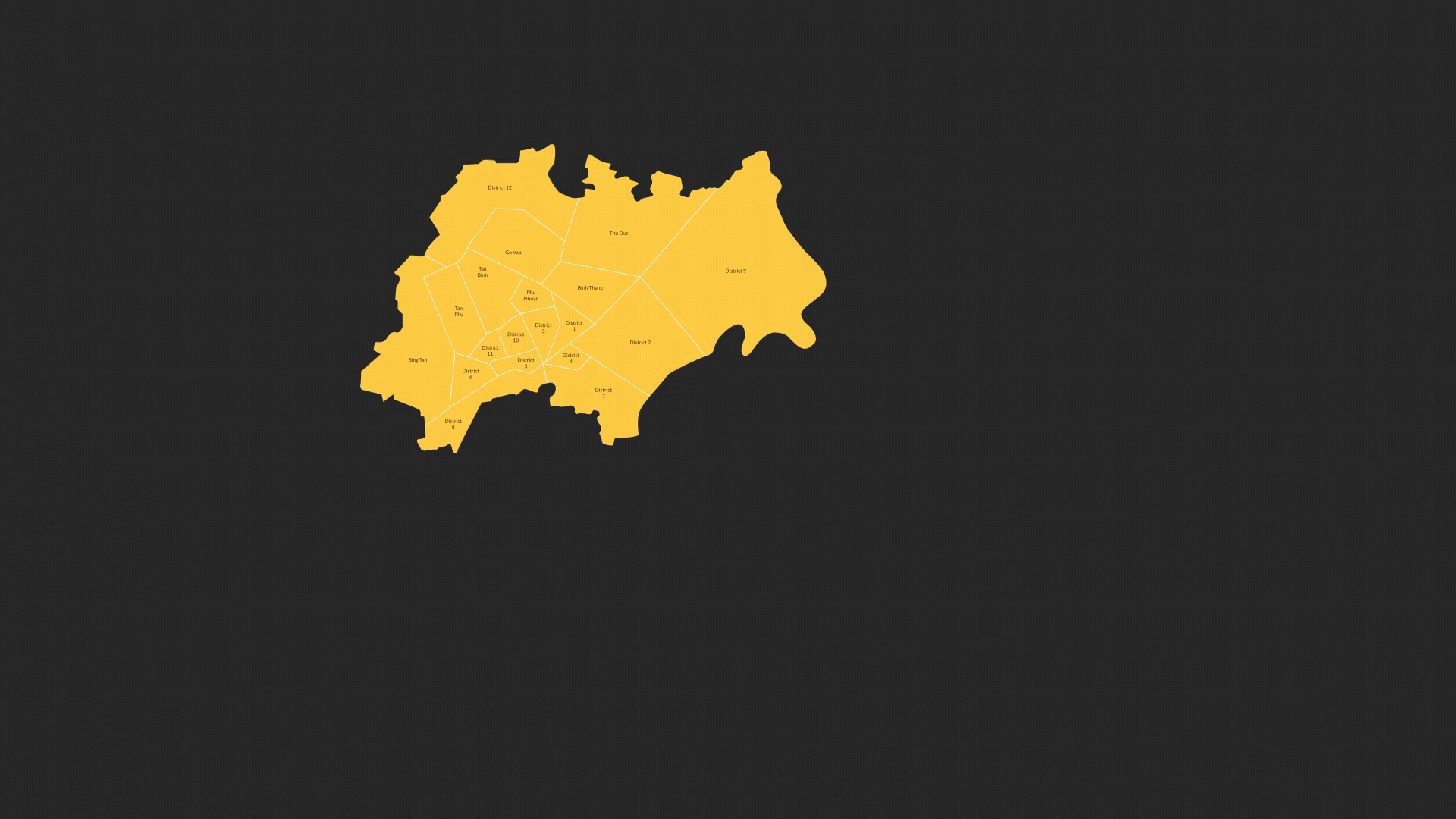
A shipping company called Fastship is facing a serious decline in completed deliveries due to two main issues:
- Reason 1: Shippers struggle to find delivery locations when relying only on street addresses.
- Reason 2: Recipients often move to a different location than the one listed on the order, making it difficult for shippers to find them.
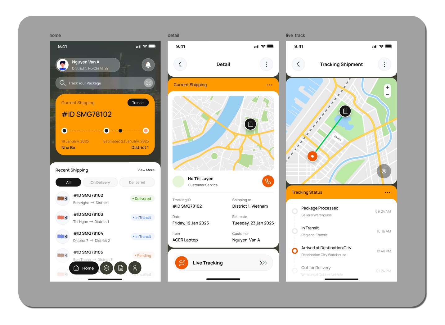
To solve this, the company introduced a new feature in their delivery app that allows users to mark locations using landmarks and images. The more accurate, detailed, and visual the information is, the easier it becomes for shippers to complete deliveries efficiently—reducing failed deliveries and order cancellations.
CHALLENGES & SOLUTIONS
Problem: Customers are very busy. They need a quick, to-the-point video that clearly explains how to use the app.
Solution: Use the minimal design approach, simple 2D style with the brand’s orange color.
The target customers are Vietnamese, so I choose the design style simple, fast, concise, and natural no need to polished or highly refined. Vietnamese people are quite casual.
RESULTS
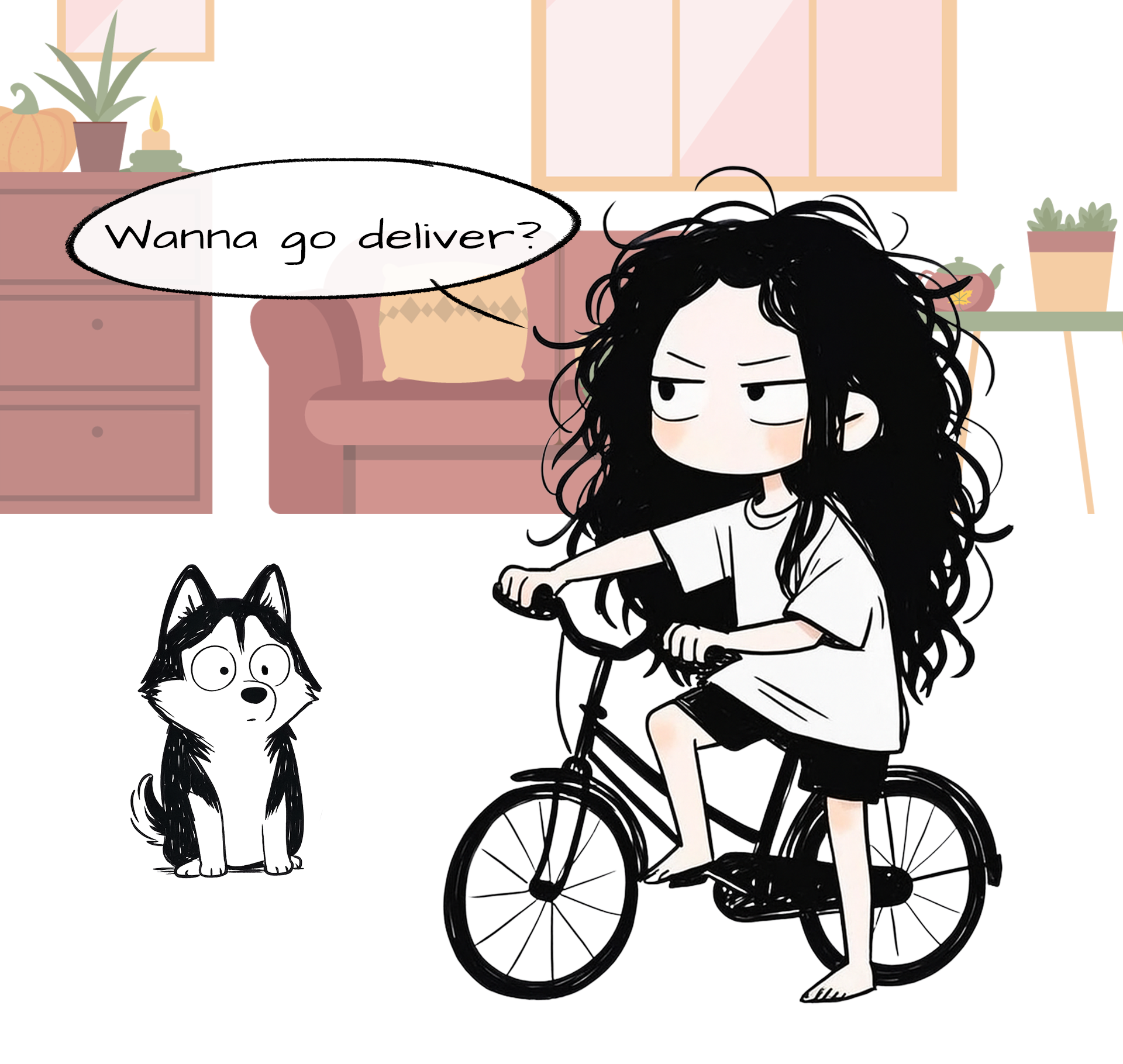
A quick introduction to Fastship.
A quick 3-step guide to using the app’s Keep Track feature.
Infographic of the results after 3 months of testing.
REFLECTION
To be honest, I found this project quite boring—especially as an animator who loves flashy VFX and cinematic effects. These videos have none of the explosions or high-impact visuals you’d see in a game trailer. But they raised an important question for me: “If I strip away all the effects, what do I have left?”
Without eye-catching effects or bold colors, I had to return to the essentials: timing and the core message. I had to truly get to the point, because there was nothing left to distract the viewer.
There’s no climax, no dramatic peaks or turning points like in the trailers or story-driven work I usually create. Instead, it’s steady and simple, centered around one key question: “What information matters most, and how can I communicate the process clearly and consistently?”
This was also the first time I seriously looked at explainer animation and infographics in terms of how they contribute to business—how they support usability, user experience, and ultimately drive conversion and results.