



With experience in the automotive industry, I build structured visual systems for brands.
Used for aligning teams, strengthening brands, creating clarity, stability, and trust, making information easier to understand and act on.
- Project Type: Public Showcase
- Category: Concept Project. This is a fictional concept project and is not associated with any real brand, company, or third party.
- Usage: Portfolio / Non-commercial
- Applications: Infographics for internal administrative use
- My Role: Visual Designer
- My Contributions: Create Brand Guidelines and explainer videos for Administration

PROBLEM
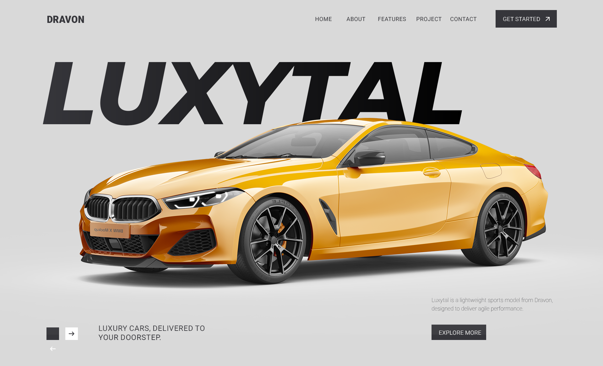
DRAVON is a racing-inspired sports car brand with three models: Luxytal, Alpha+, and Race+.
Inconsistent branding, varied interpretations, and misalignment among teams and customers led to inefficiency.

ALPHA+
Pickup

LUXYTAL
Sedan

RACE+
Sport car
CTA : Book a test drive
SYSTEM 1
A structured brand system standardizes visual communication, making it easier to apply and stay consistent.
It uses bold contrast and controlled composition to balance a premium automotive feel with clear, flexible, high-impact visuals.
- If the logo feels too plain, the text can be stylized;
- if the color palette feels too constrained, the layout should highlight the main subject.
🟦 Layer 1 — Perception Design
(how the brand is seen and felt)
🟩 Layer 2 — Structural System
(how information is organized and scaled)
🟨 Layer 3 — Application & Consistency
(how the system performs in real use)
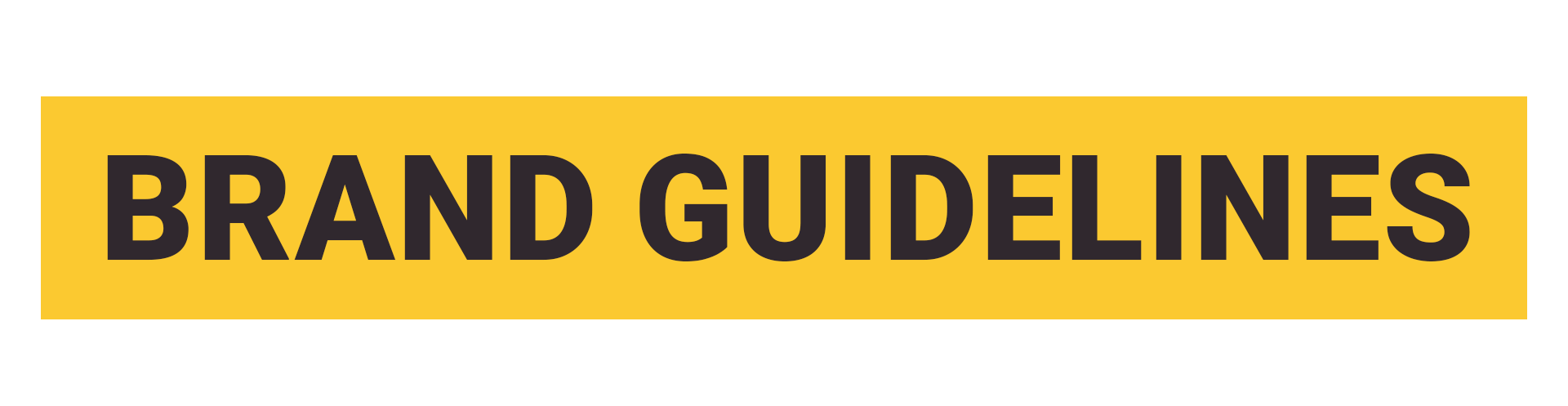
LOGO
- Text-based logo: clear, memorable, trustworthy, scalable, motion-friendly.
- Icon logo: small, clear, distinctive at any size.
Strong focal points for instant brand recognition[🟦Perception]

Primary Logo

Logo Variations

Secondary Logo
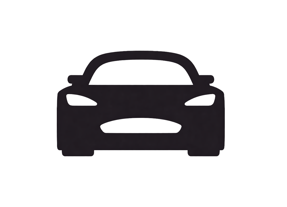
Icon Logo
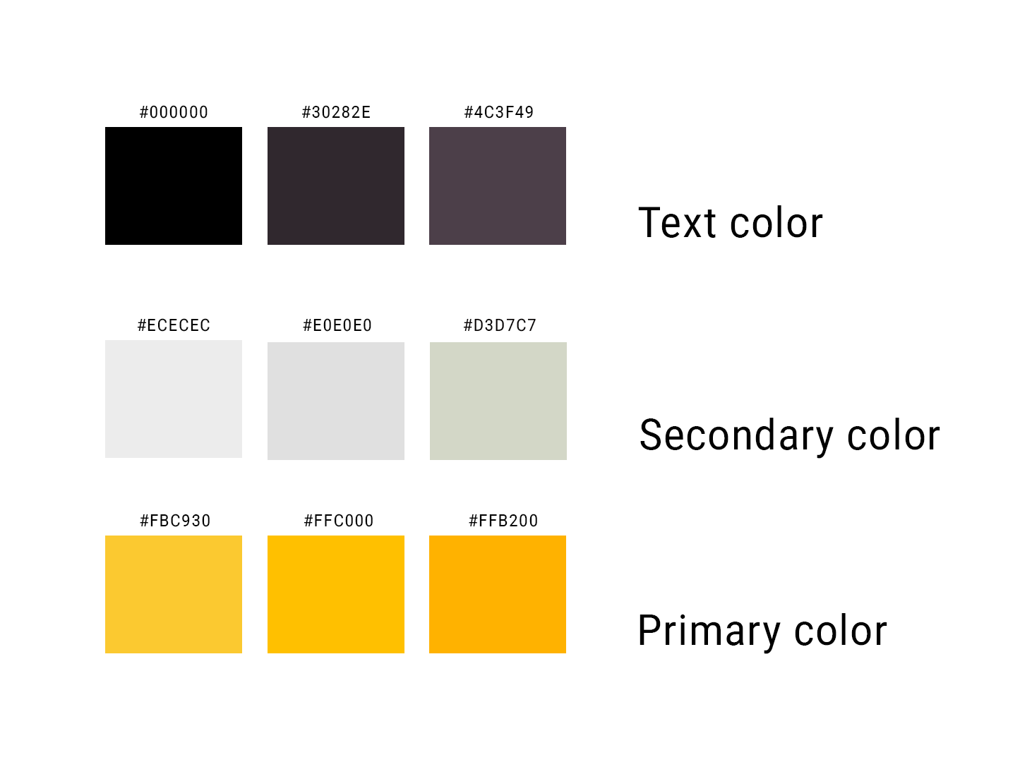
color palette
Standardizing visual elements for consistent brand application
- Orange and black (red-leaning): simple, modern, high-contrast, adjustable to avoid eye strain.
Controlled color palette to maintain visual clarity [ 🟦Perception ]
FONT
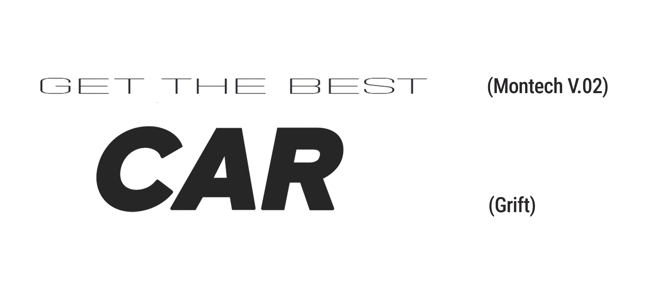
Defining hierarchy and readability across communication materials
- Grift: bold, strong, structured, with a slight italic to balance the rigid colors and logo.
- Montech 2.0: light and refined, balancing the heaviness of the bold font and reducing visual monotony.
- Additionally, common fonts like Montserrat or Roboto (Google Fonts, open-source) can be used to avoid licensing issues.
Bold visual contrast to establish premium perception [ 🟦Perception ]
Typography hierarchy guiding readability and emphasis [ 🟩Structure ]
GRID
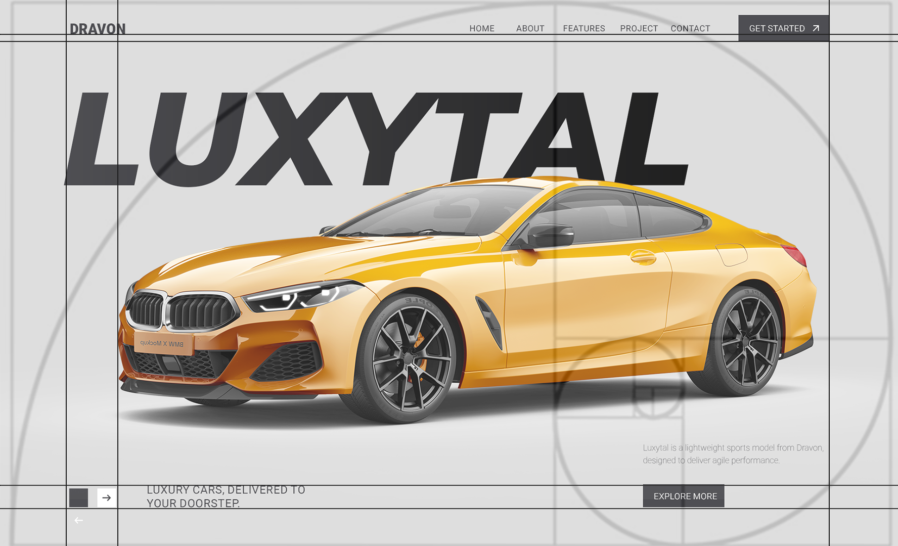
Creating structured layouts to guide information clarity.
- The grid keeps the product centered and balanced.
- The Fibonacci ratio maintains focus and consistency across scales.
- Text and UI elements are arranged with clear relationships, not randomly.
Grid system ensuring layout consistency across assets [ 🟩Structure ]
Extended Applications
While keeping a premium base, some cases use higher visual intensity for promotions.
- Fonts and colors can vary for creativity while keeping core principles.
- Effects like lighting, color, and smoke are used selectively to enhance impact without clutter.
Can increase intensity captures attention but keeps the product central.
Modular components for scalable brand applications [ 🟩Structure ]
RESULTS
- Improved clarity, alignment, and efficiency in internal workflows.
- Established a cohesive, scalable visual system.
- Enhanced visual hierarchy and product emphasis in multiple formats.
Consistent layout applied across campaigns and formats [ 🟩 Structure →🟨Application ]
Visual displays in the showroom and warehouse.
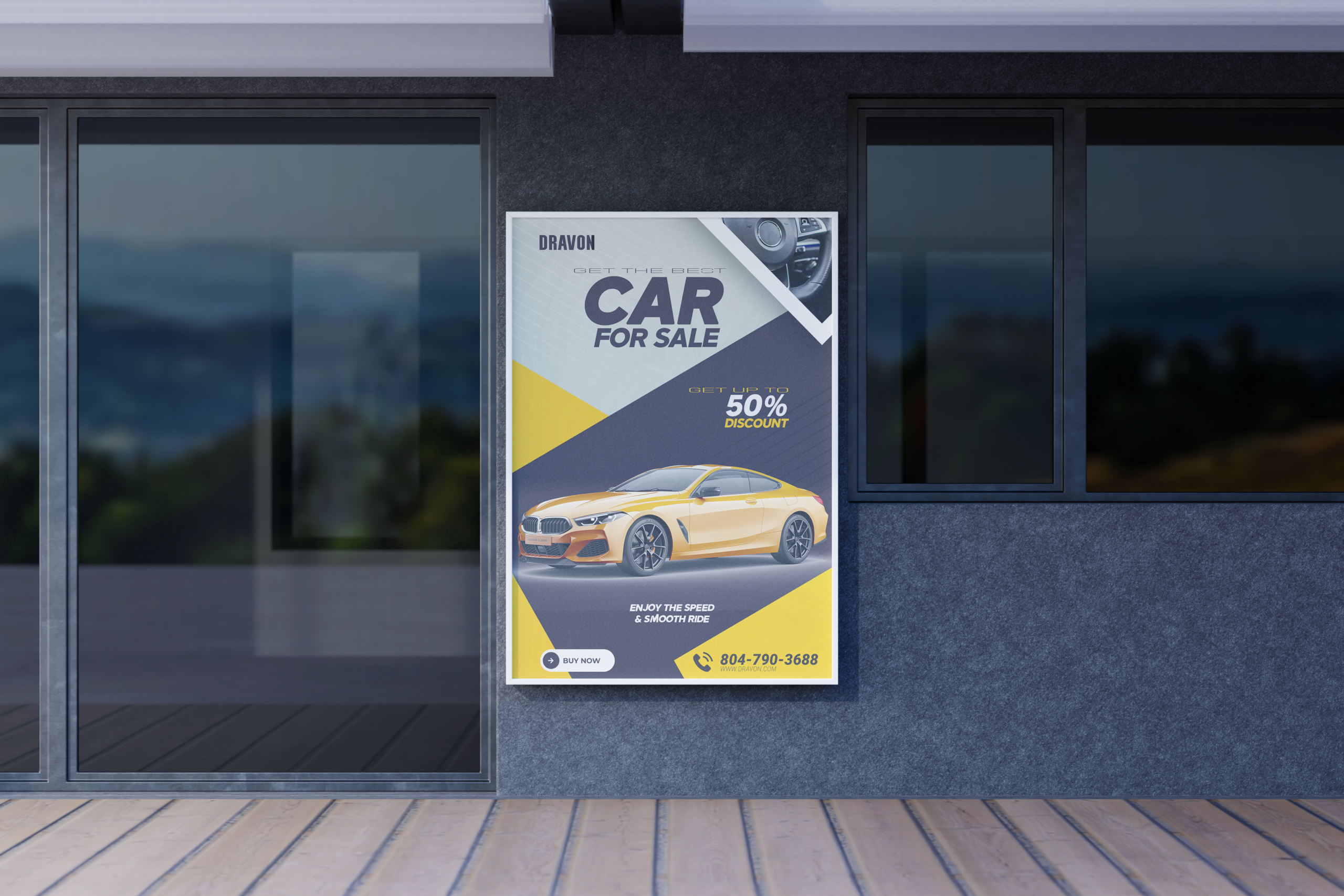

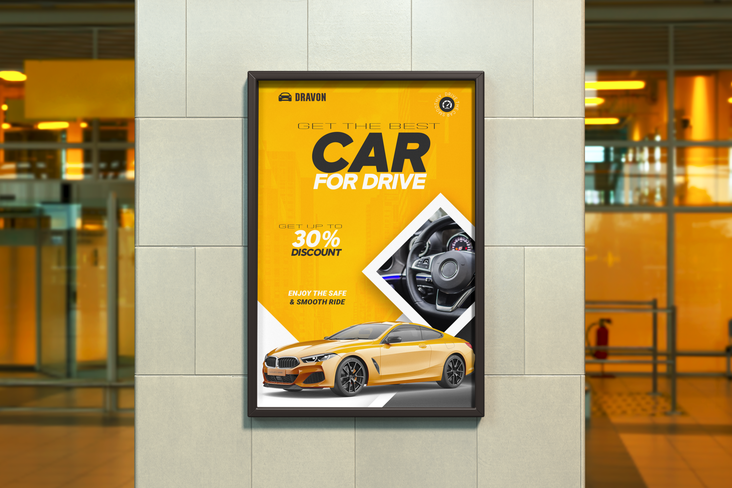

Brand system adapted for posters, social, and motion [ 🟩 Structure →🟨Application ]
Event flyer for customers.


Visual consistency maintained across different touchpoints [ 🟨Application ]
SYSTEM 2
A structured visual system using a dark gray palette and sequential information flow, applied to technical specifications for clarity and focus.
Glass-style UI elements are used in the checklist to create contrast, reinforce a modern premium feel, and keep key information prominent.
From system definition to real-world execution [ 🟩 Structure →🟨Application ]
RESULTS
A feature overview module presenting technical specifications
A pre-delivery checklist video to help teams apply the system consistently in daily workflows.
REFLECTION
This project reinforced the perspective: consistency is not about repetition, but system design. By defining clear rules for hierarchy, layout, and structure, a scalable brand working across formats was built while maintaining clarity and controlling visual intensity.
It also shaped my perspective on administration work: data, checklists, and documentation are not just support, but the backbone of operations, enabling better decisions and risk management.
Design, therefore, should not be separated from business operations. Brand Guidelines are not just visual rules, but a structured system connects design with business operations, ensuring clarity, consistency, and long-term reliability.