- Project Type: Public Showcase
- Category: Concept Project. This is a fictional concept project and is not associated with any real brand, company, or third party.
- Usage: Portfolio / Non-commercial
- Applications: Introduce the product within the store area and near schools.
- My Role: Graphic Designer
- My Contributions: Create a mascot and brand visuals, including assets for mockups, posters, flyers, and the logo.
CONTECT
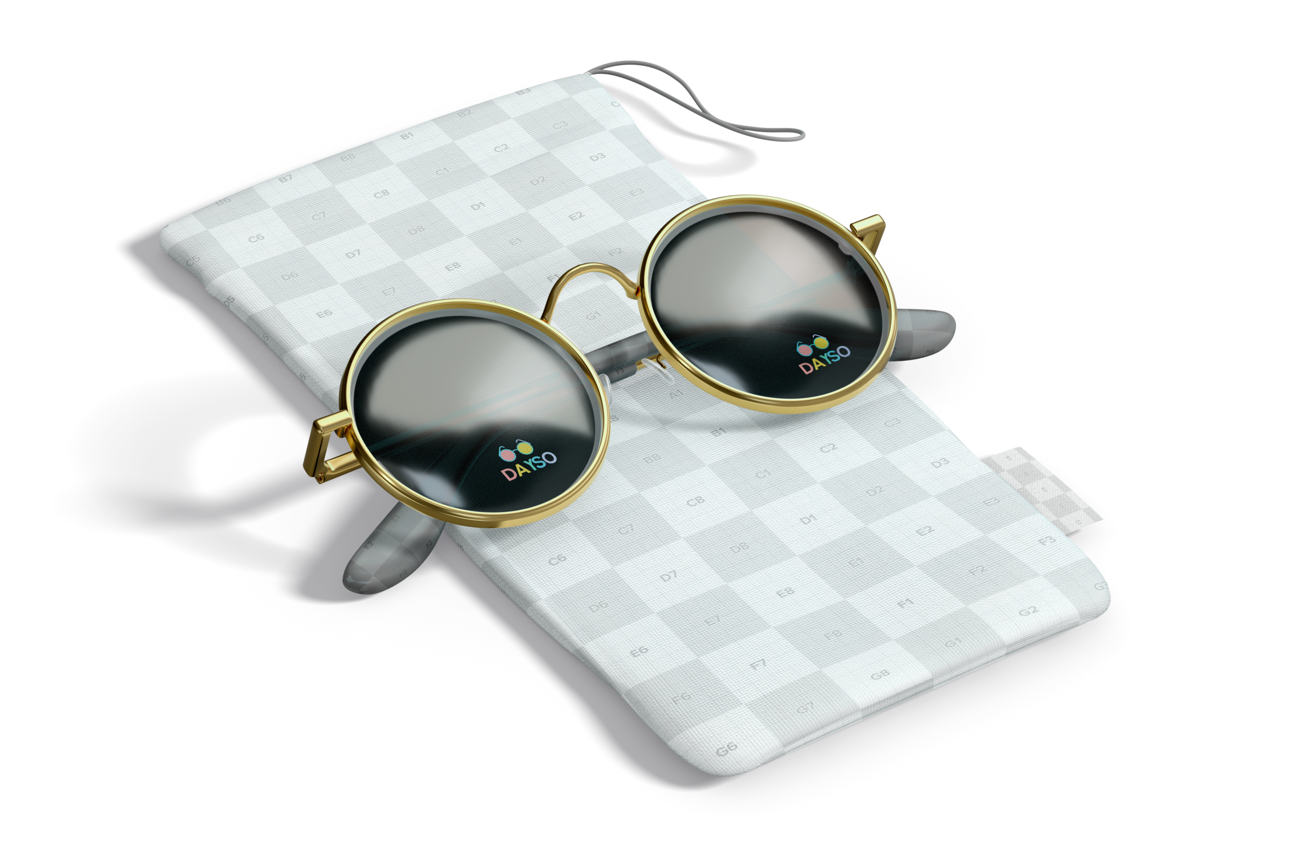
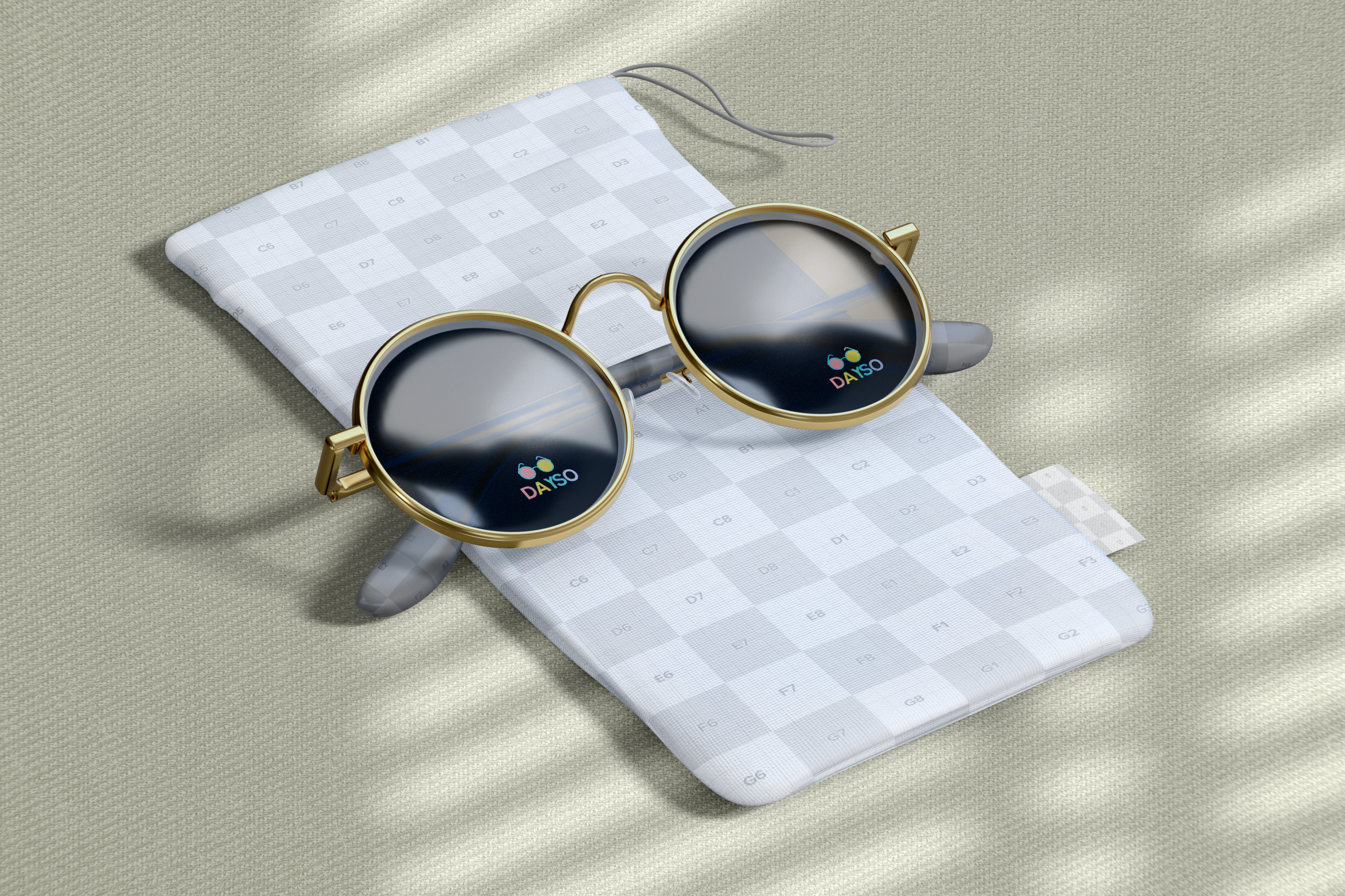
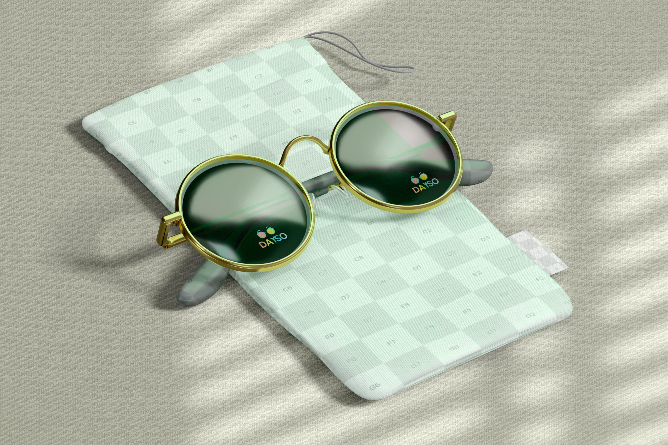
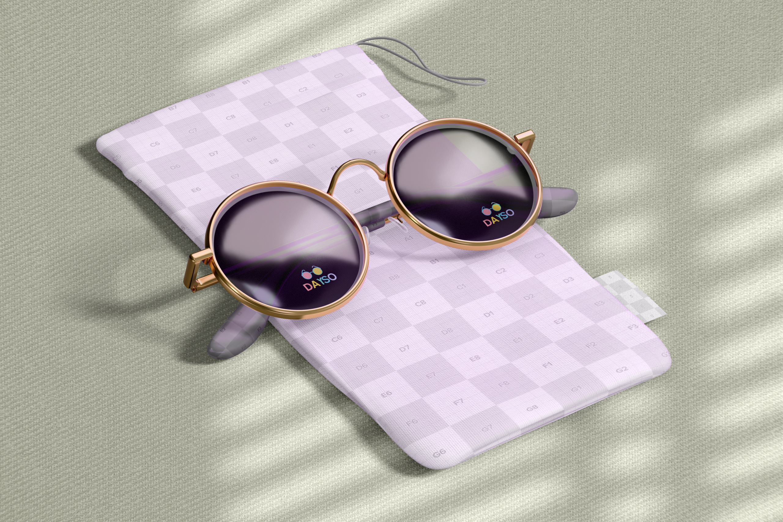
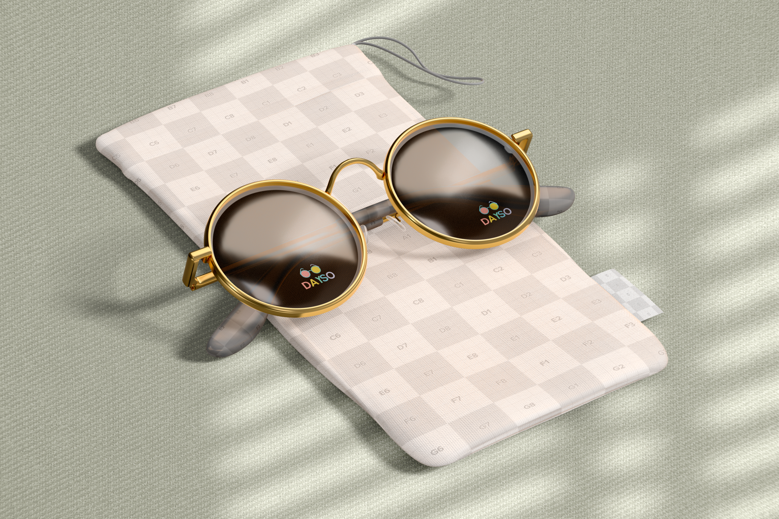
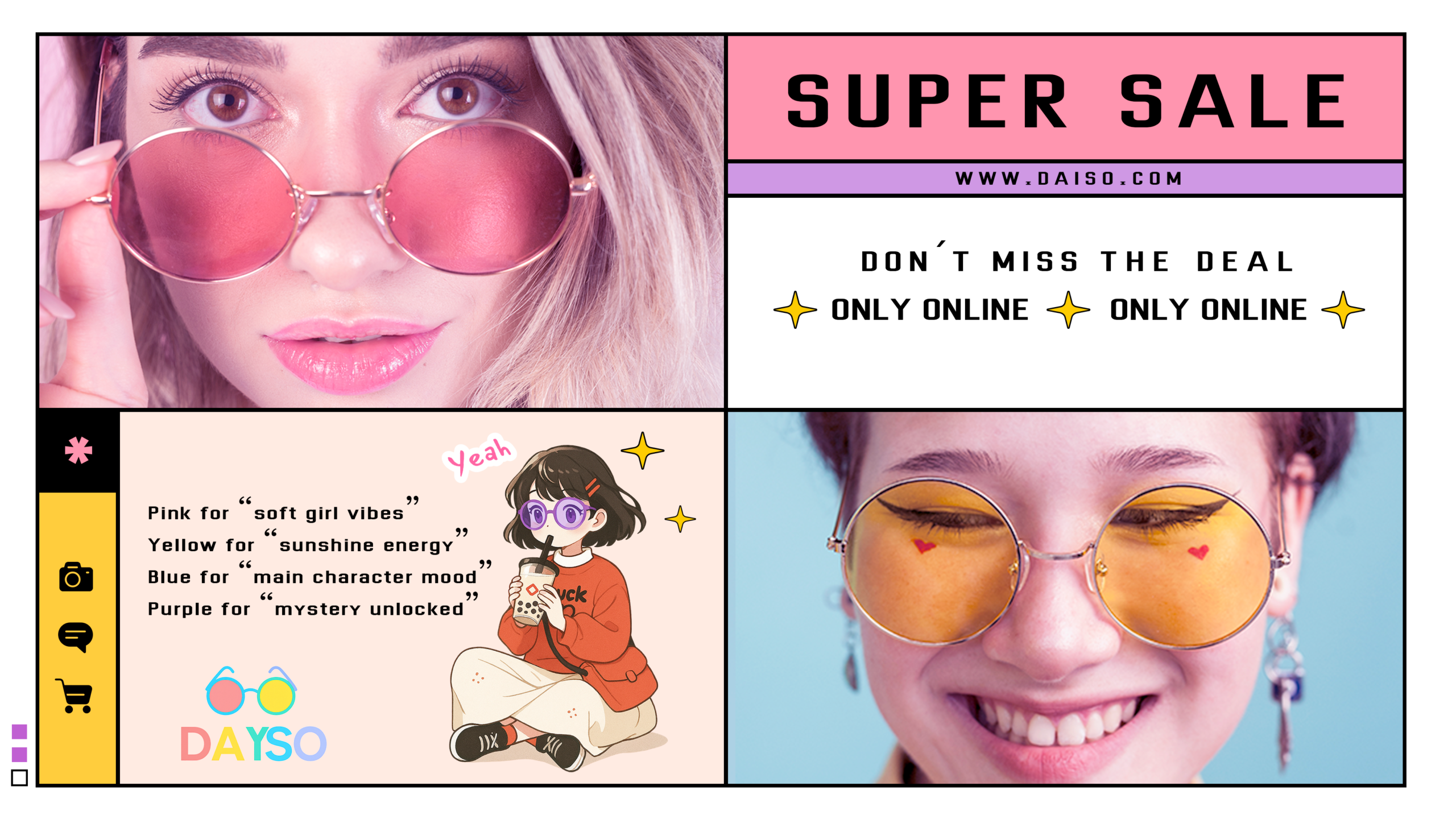
This is a colorful round-frame eyewear brand for young people, targeting students. It carries a mix of fashion and a touch of rebellious spirit. It not only improves vision and provides UV protection, but also works as a stylish accessory for going out.
PROBLEMS
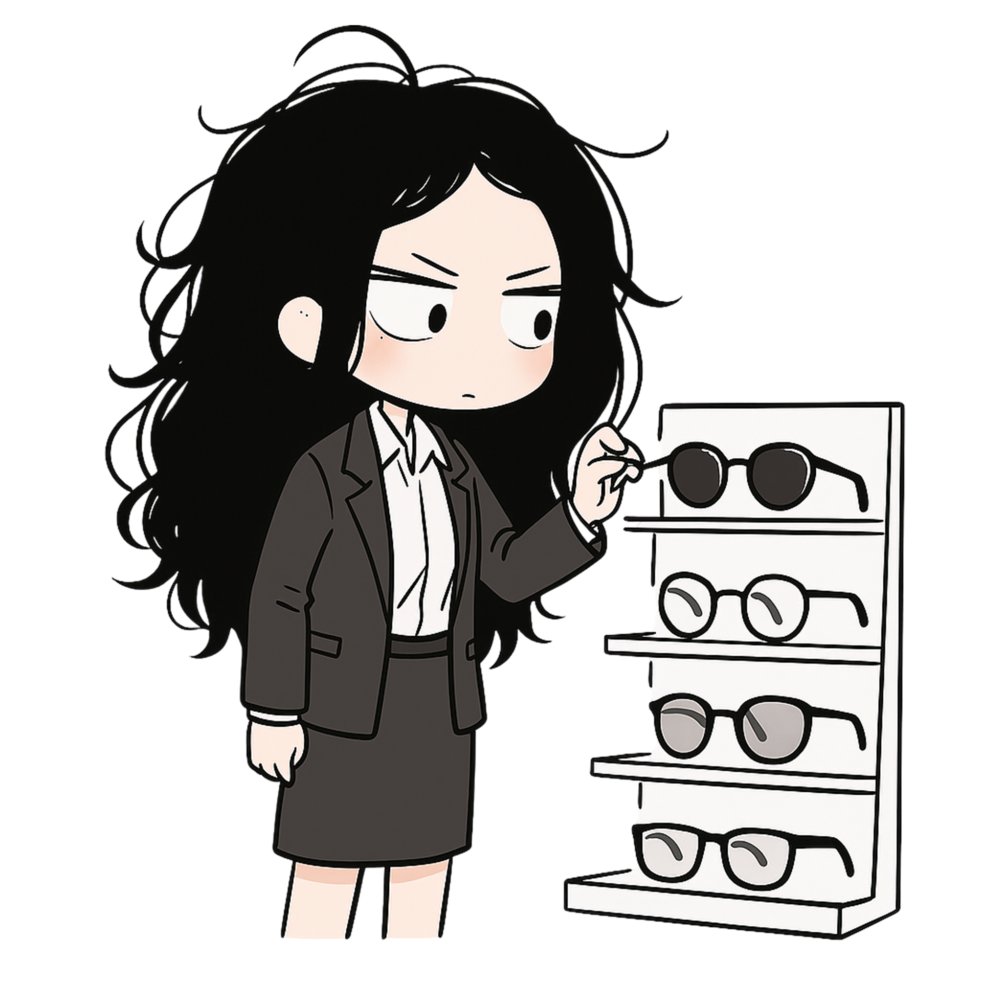
Problem 1: How can we encourage young people to embrace lightly tinted eyewear instead of traditional clear lenses? How can we help them appreciate and accept this subtle yet distinctive sense of style?
Problem 2: How can a premium brand feel approachable and relatable to young audiences, rather than distant or exclusive?
INSIGHT
The more you see something, the more you get used to it—not necessarily because it’s beautiful, but simply because it becomes familiar.
This also reflects my own experience in design. There have been many animation videos I had to redo to update licenses. Even though I could have made them look better, I honestly just wanted to keep them the same—simply because they felt familiar, stable, and well-balanced across all elements.
So we need to create familiarity.
Gradually, a sense of familiarity begins to form—those street corners, that signage, those little items become part of memories and experiences. Through word of mouth among students, the store becomes a place they regularly visit and shop at.
SOLUTIONS & RESULTS
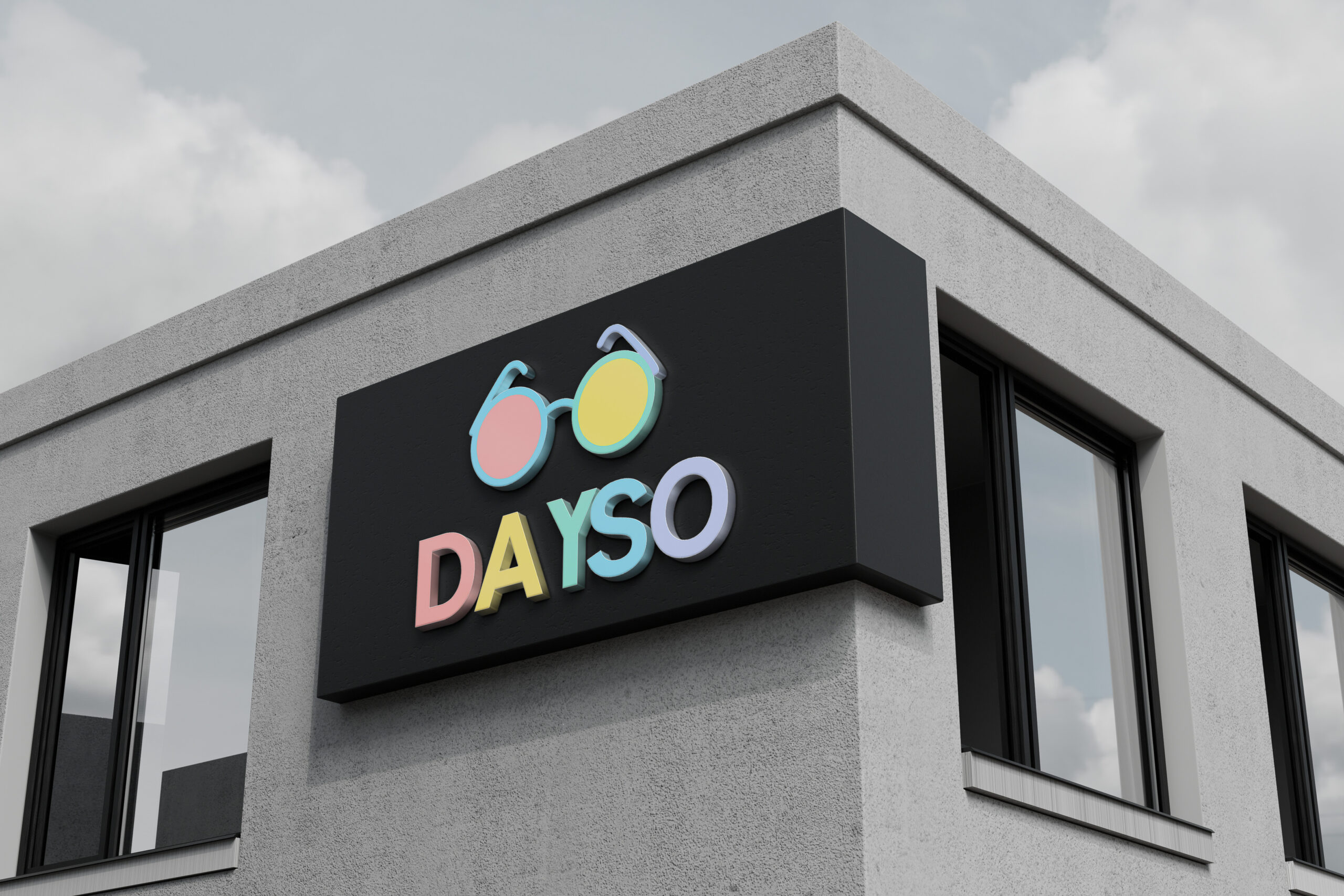
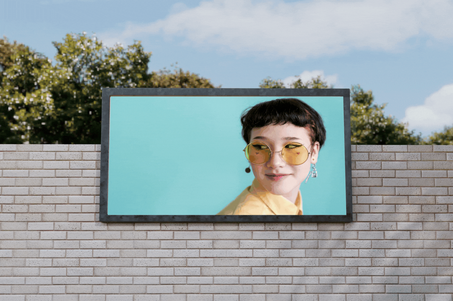
Solution 1: Place the brand logo prominently on the storefront to create a strong visual focal point, aligned with the minimalist style often seen in well-known brands.
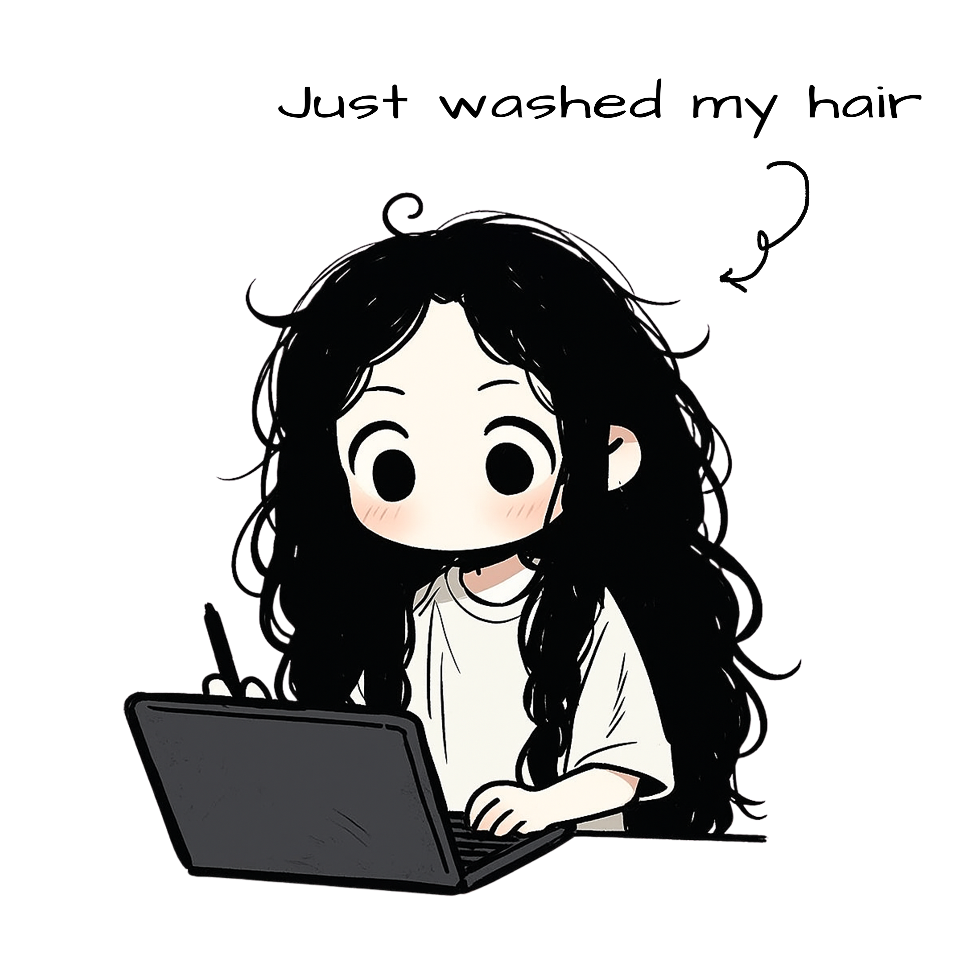
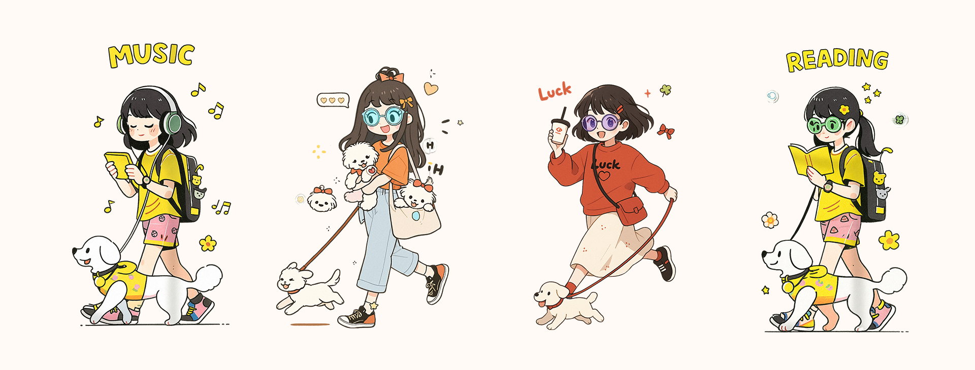
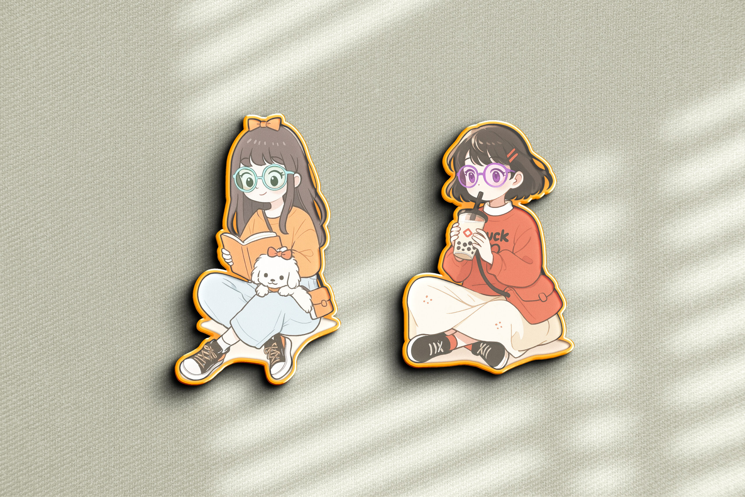
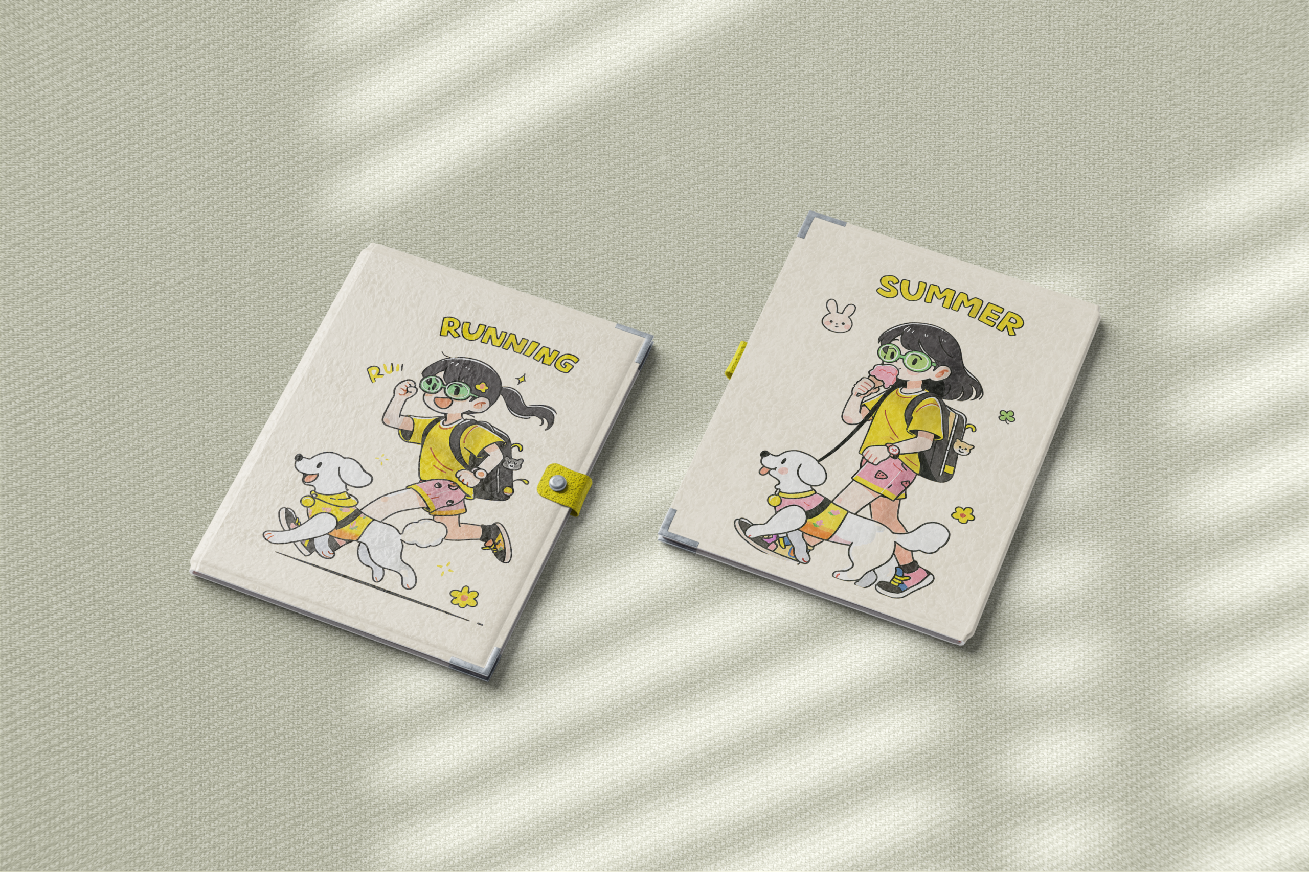
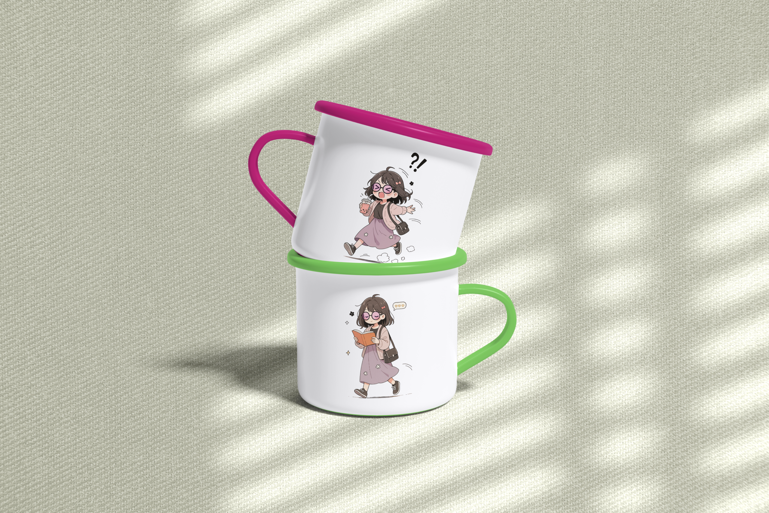
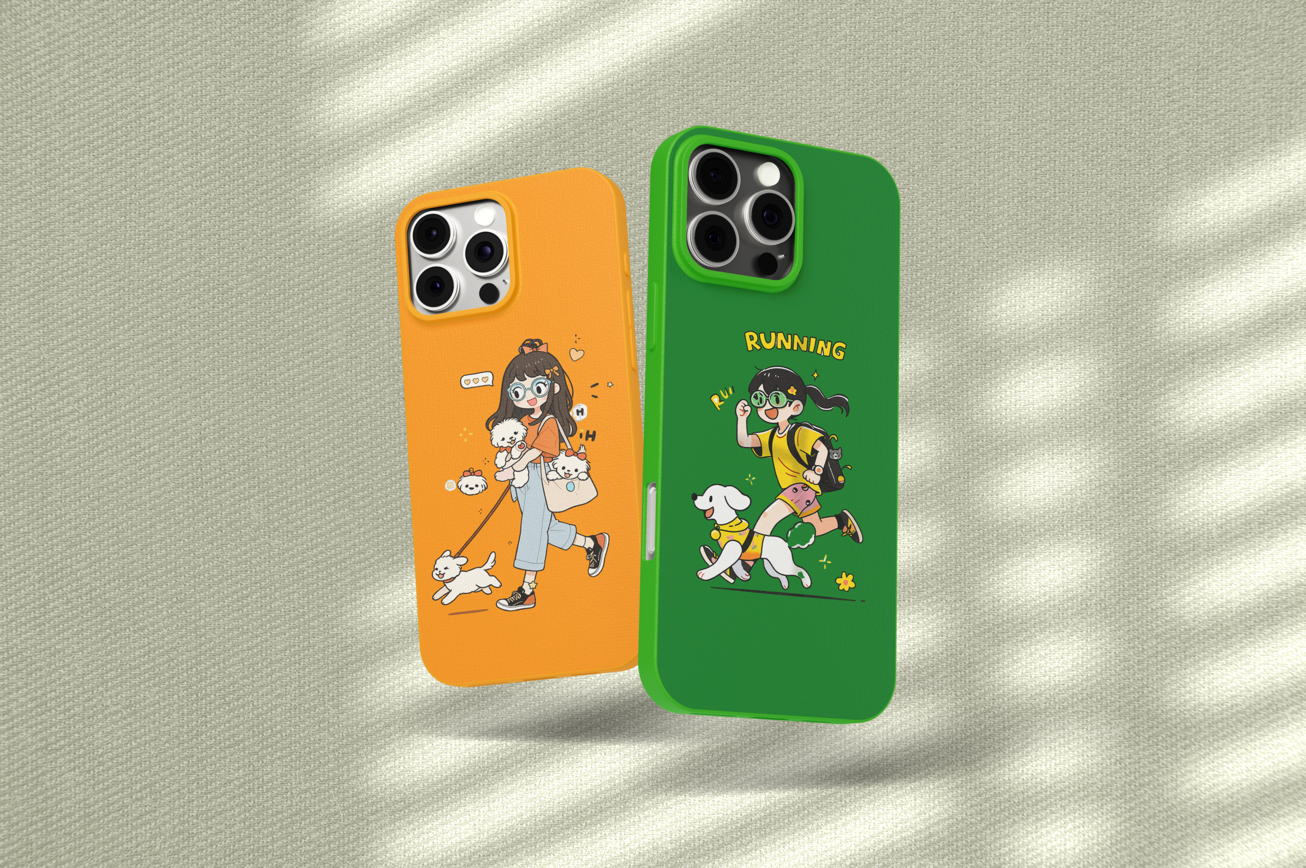
Solution 2: Develop a set of colorful, cute, and playful girl character avatars to represent the brand.
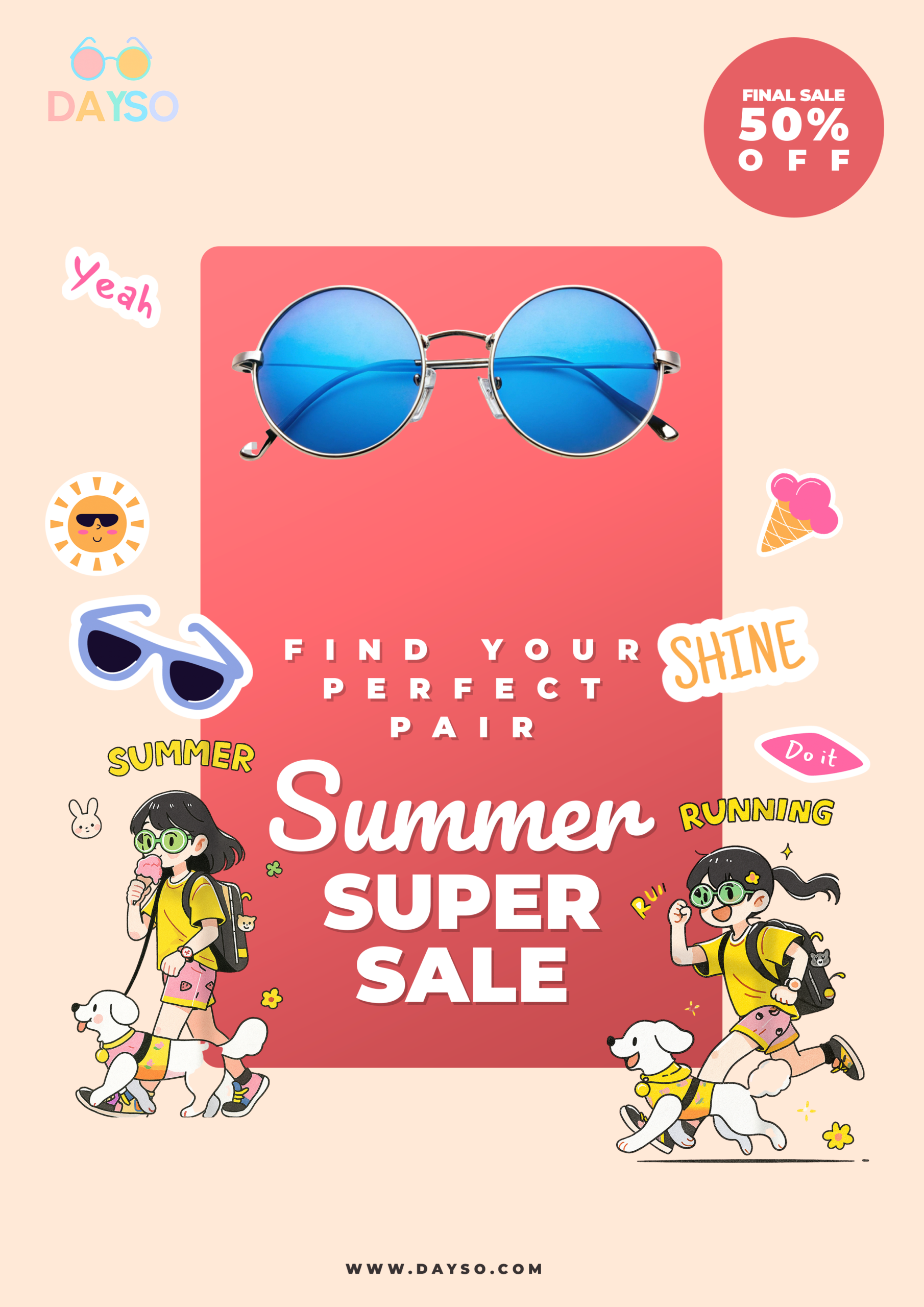
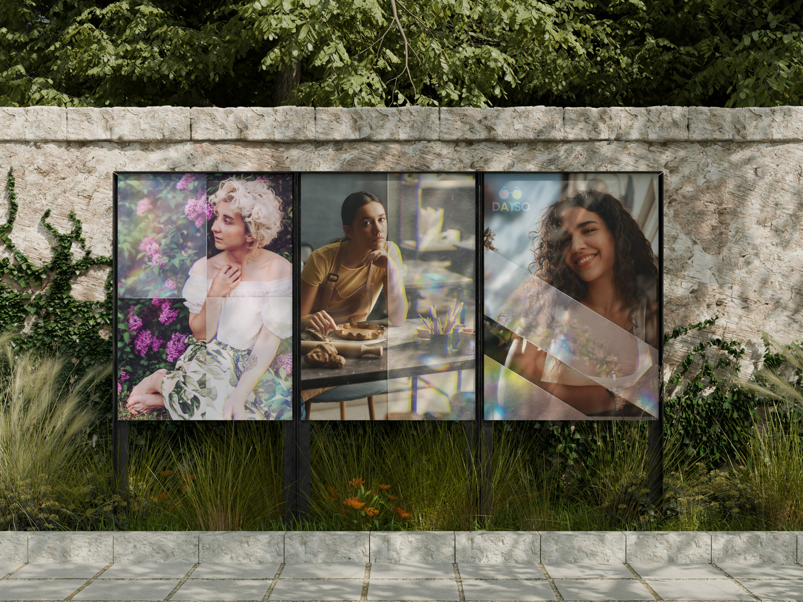
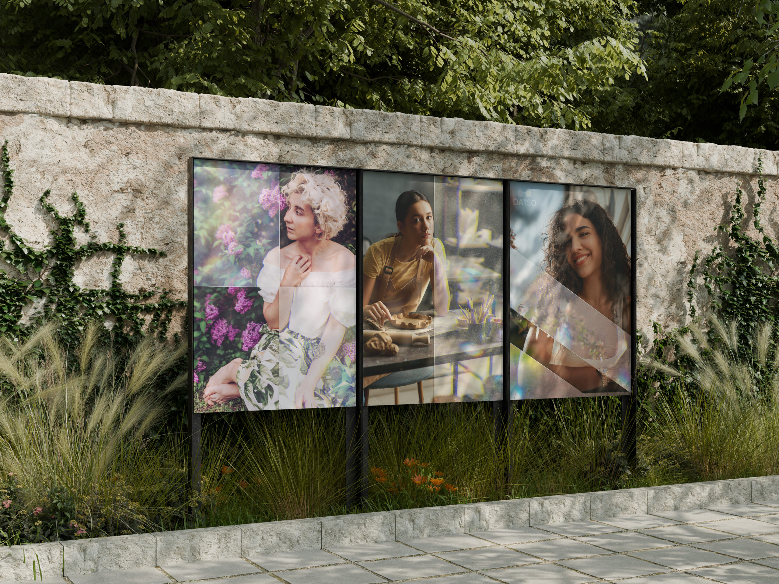
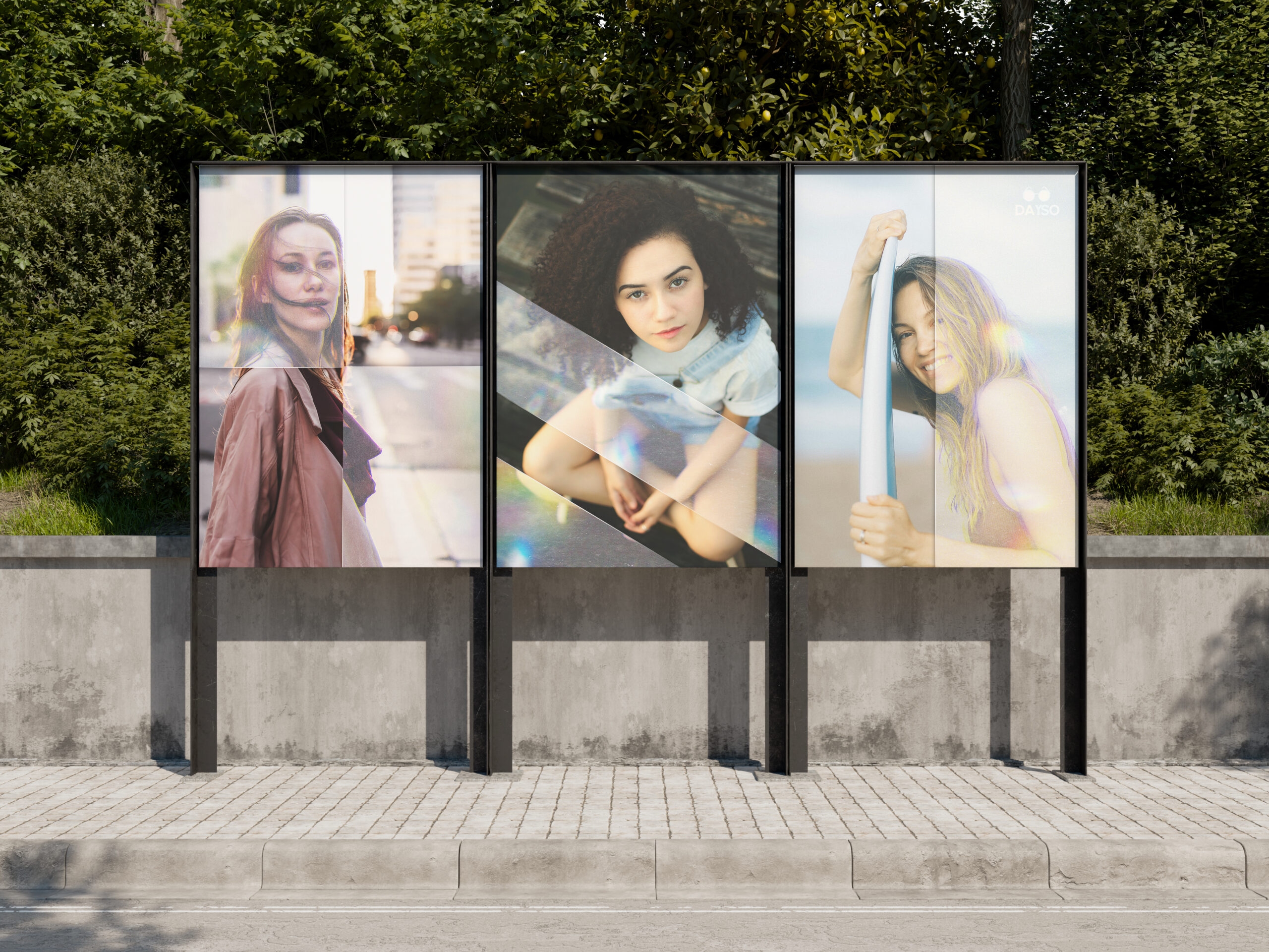
Solution 3: Create posters and flyers with a bright, vibrant style, using shape design and characters to highlight a sense of youthfulness and ease.
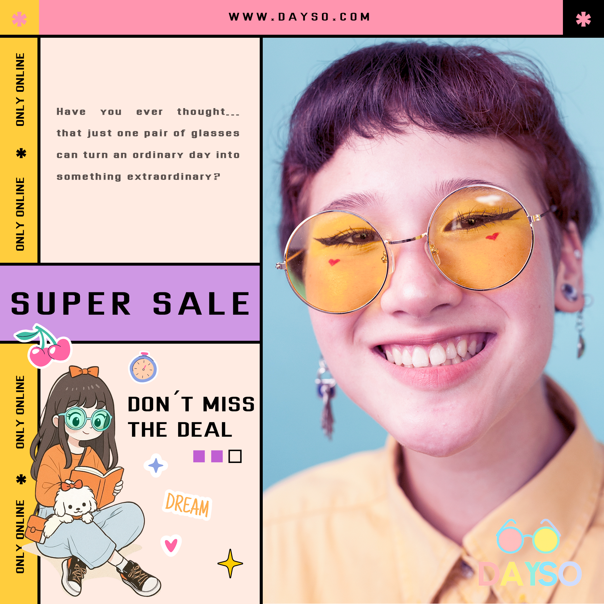
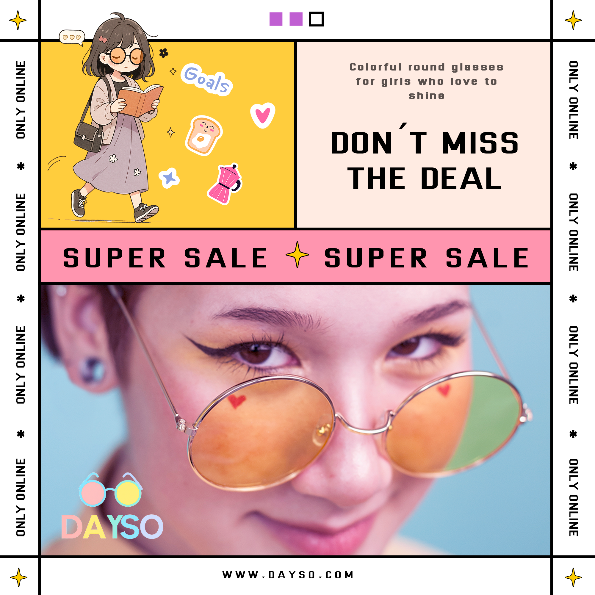
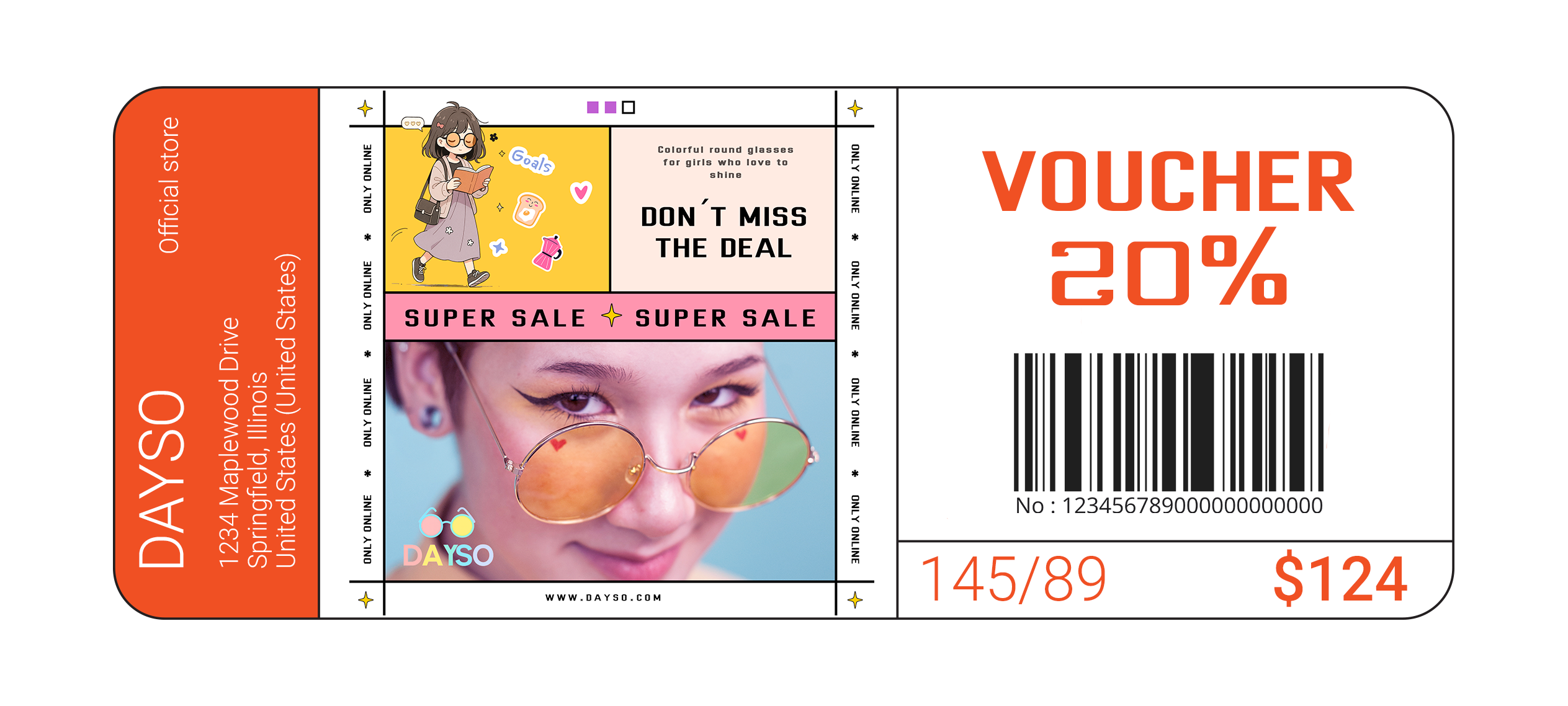
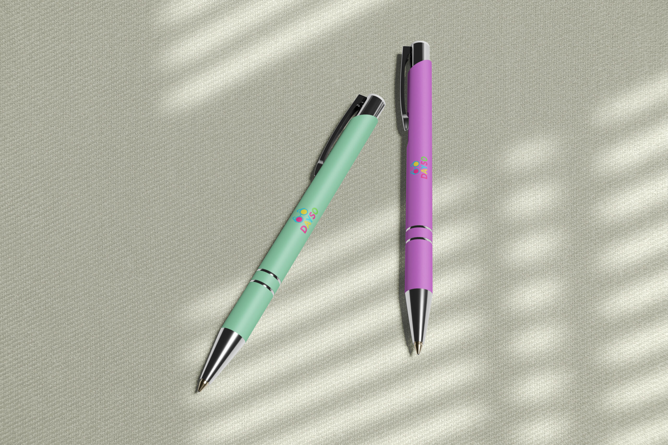
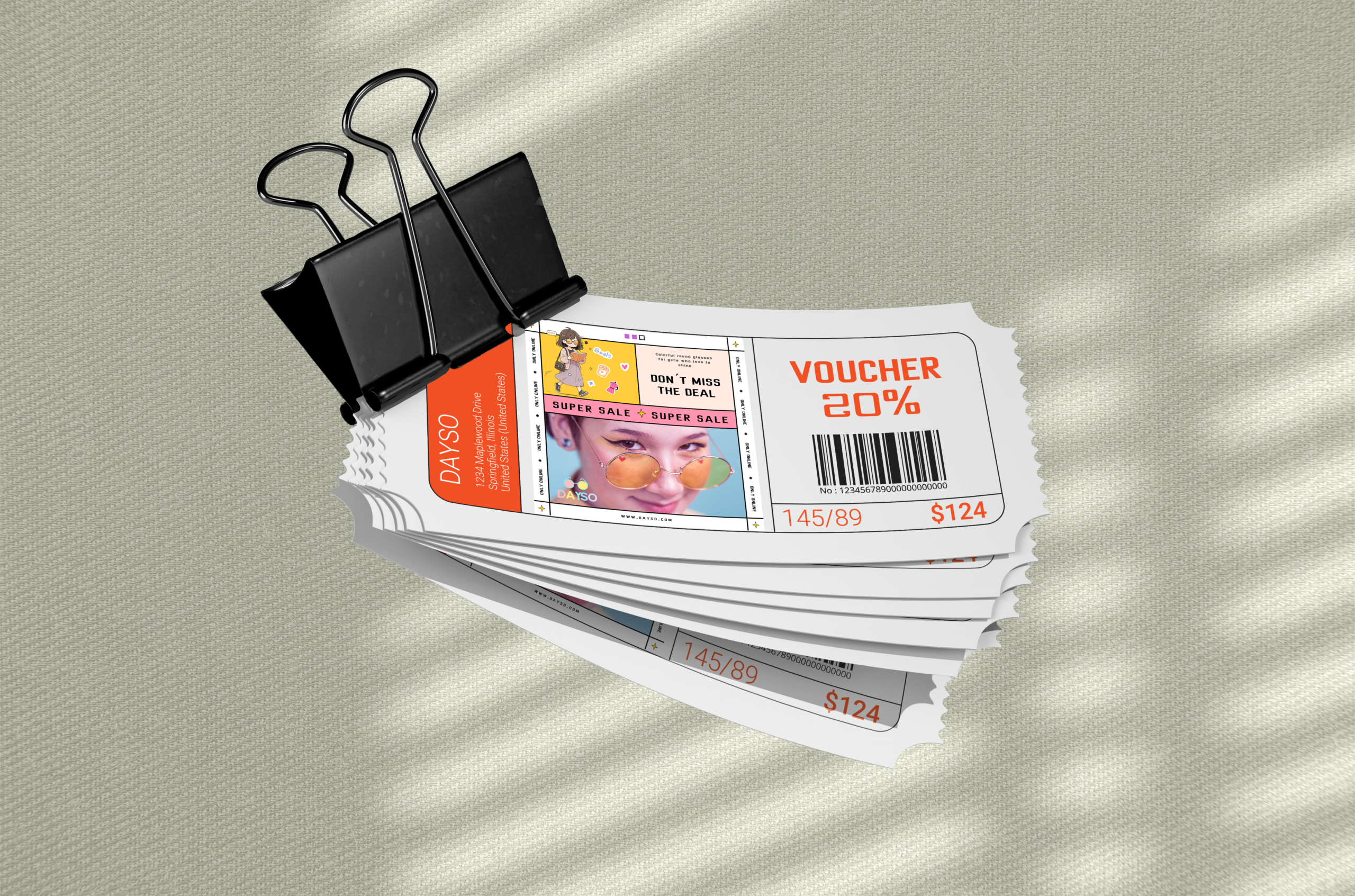
Solution 4: Design small, charming printed materials—such as flyers and stationery—featuring the brand’s logo and character.
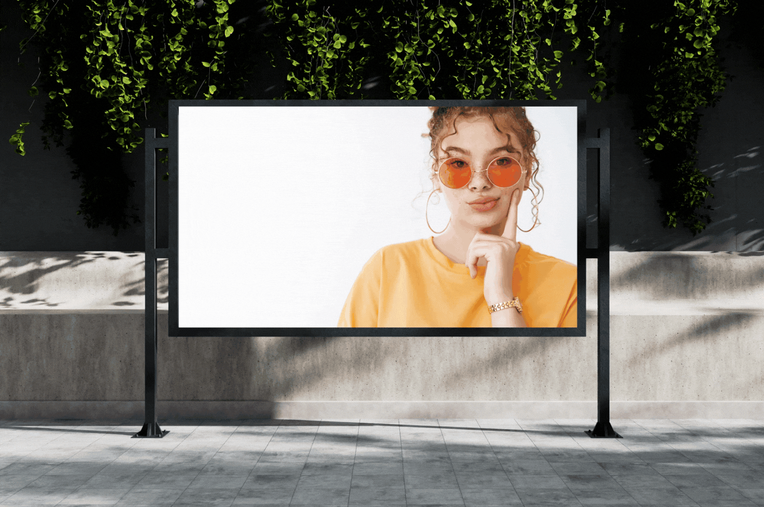
Solution 5: Create banners and billboards around school areas with a fashion-focused message—showing how artistic the world can look through tinted lenses, combined with the brand logo. Not only static banners, but also animated ones.
REFLECTION
This is another case study that I found quite “boring.” It doesn’t have dramatic peaks or instant wow moments, but instead blends so seamlessly into its surroundings that you barely notice its presence. And that actually requires a high level of subtlety.
It’s similar to how I add music to a video. What makes a piece of music truly good and fitting? It’s when, once placed, you no longer notice it—it becomes one with the visuals. If the music feels too prominent or turns into noise, then it means it’s not right.